Press Release
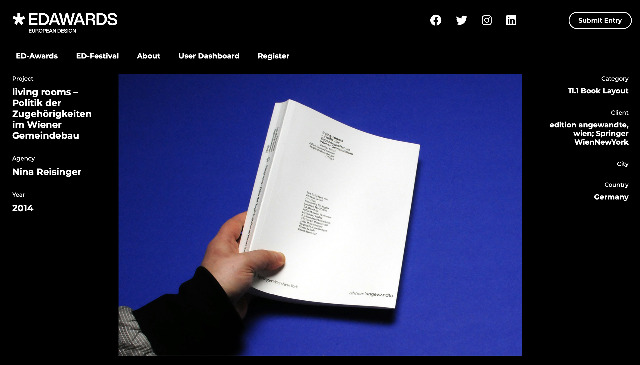
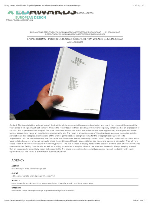
The book is taking a closer look at the traditional viennese social housing system today, and how it has changed throughout the years since the beginning of last century. What is the reality today in these buildings which were originally constructed as an expression of socialist and superdemocratic utopia? The book combines the work of artists and scientist who have approached these questions in the form of essays, interviews, art installations, photography etc. The result is a kaleidoscope of historical takes, personal memories, artistic perception and sociological examinations of the wiener gemeindebau. Design: Looking for the typographical equivalence to ”superdemocratic” or ”social housing”, the fonts Arial and Times New Roman inevitably come to mind. They used to be THE two fonts which were installed on every windows computer since the mid 80s and thereby accessible for free to anyone owning a computer. Thas why we chose to set the book exclusively in these two typefaces. The use of those everyday-fonts on the scale of a whole book of course demands some antipoles. Exiting type details, as well as pushing boundaries in weights, sizes or live area was the result. Always keeping in mind, that an essay reader essentially needs to be read in the first place, we combined essential typographic rules of readability with subtly tapered details. The result is a minimalist but beautiful book.
Award Ceremony
2014-05-01, Köln, Deutschland


